Blocks: top of the page
The blocks that build the top of the page: header, hero, headings, call-to-action and spacers. Each block shows its settings panel and, where useful, an example of how it looks on the page.
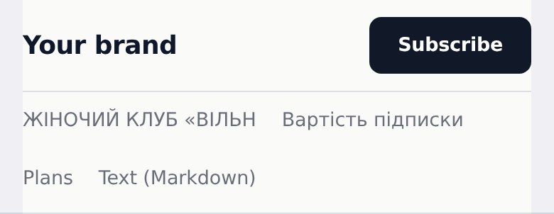
Header bar
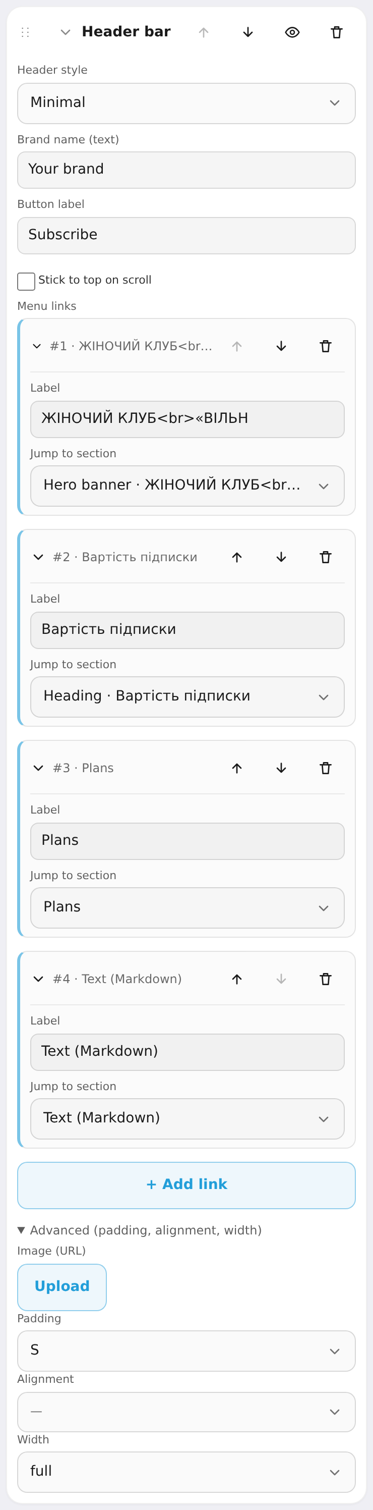
Top bar: logo/name left, links center, a CTA button right. Settings: header style (minimal / glass / centered / floating / swiss), brand wordmark, button label, stick to top on scroll, menu links (label + jump to a page section).
Hero banner
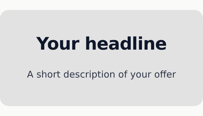
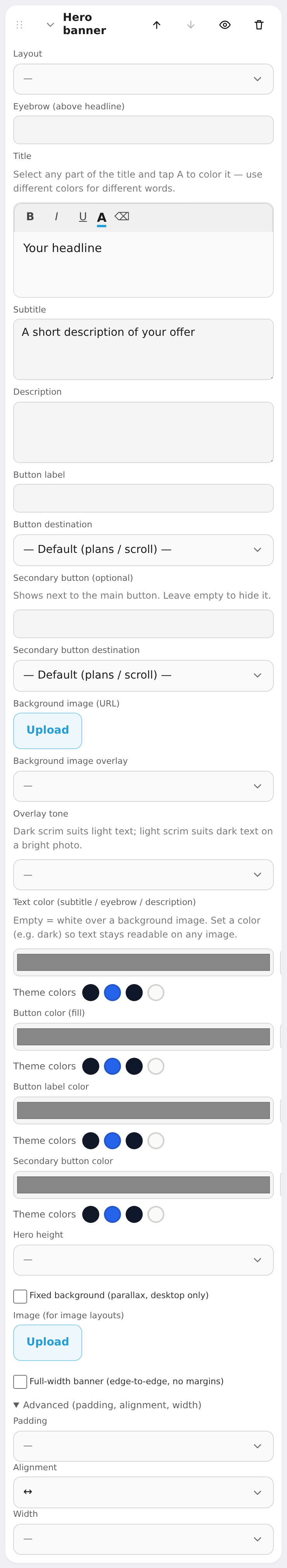
Big first screen: title, subtitle, description and buttons. Settings: layout (stack / image left / image right / showcase mockup), eyebrow, title, subtitle, description, primary button text + target, secondary (ghost) button + target, background image, background overlay (none/light/medium/dark) and tone, text and button colors, height (auto / M / L / XL), fixed background (parallax, desktop).
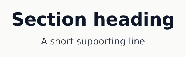
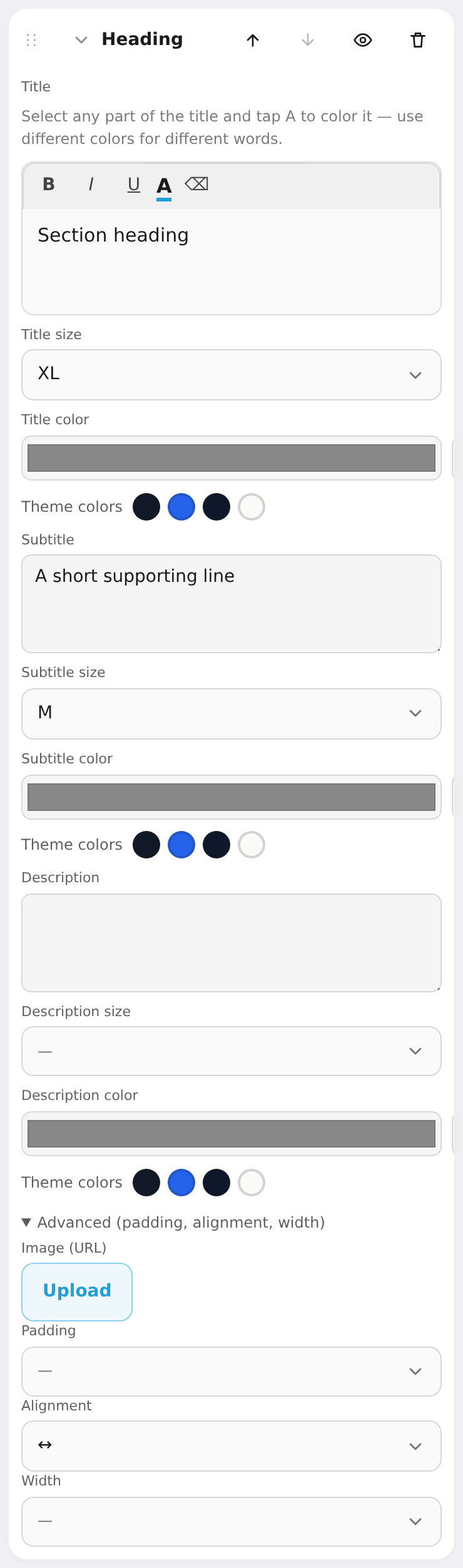
Heading
A simple text block: title, subtitle, description — no image or buttons. Handy as a section divider. Settings: text plus size (S/M/L/XL/2XL) and color independently for the title, subtitle and description.
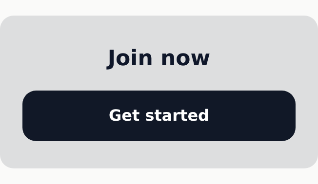
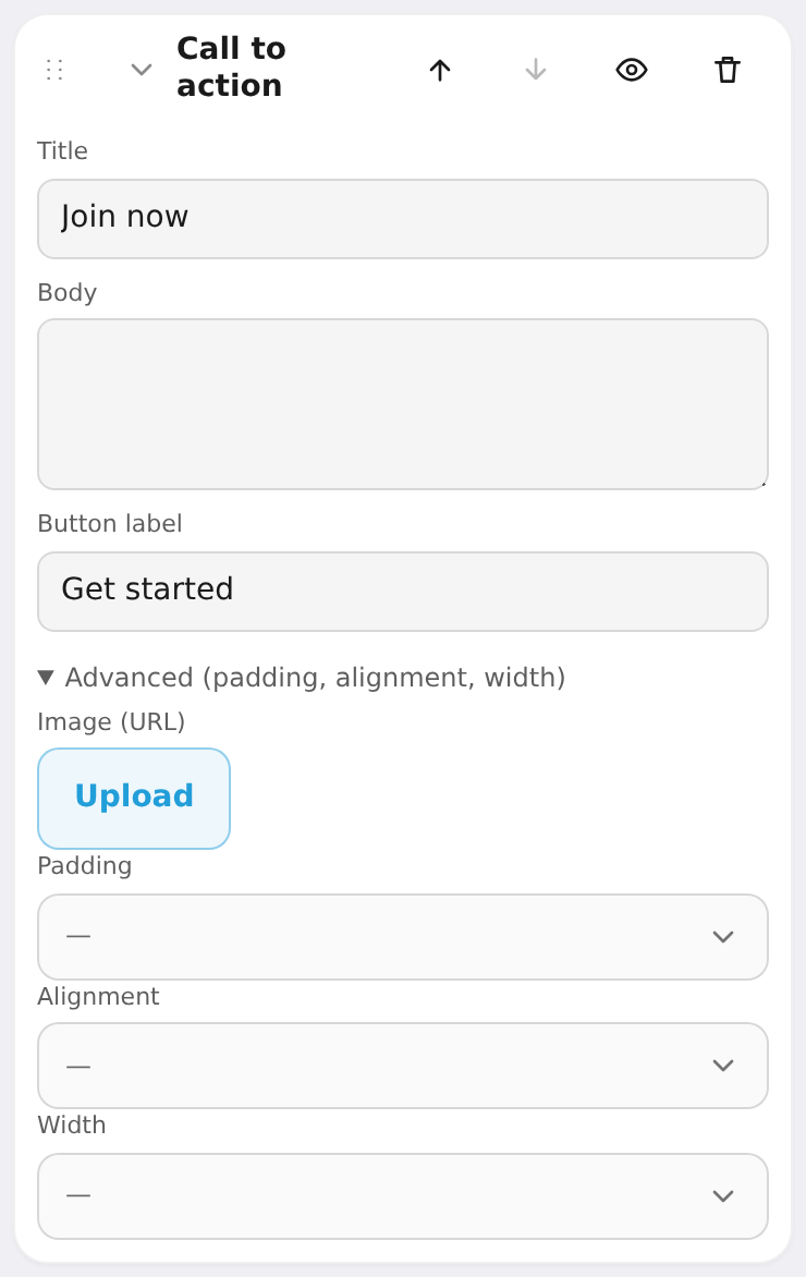
Call to action
A call-to-action strip that leads to your plans. Settings: title, body, button label. The button always scrolls to the first "Plans" block.
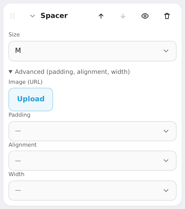
Spacer
Empty vertical room to control rhythm between sections. Settings: size (S / M / L / XL).